Insights / Averane perspective
Your Website Doesn't Have to Be Easy to Use
The web design industry has spent years trying to eliminate friction. It may have eliminated some of the experience with it.
There is a piece of advice in web design that has become so universally accepted that it is rarely questioned anymore: reduce friction.
Make the navigation simpler. Reduce the number of clicks. Shorten the copy. Make the buttons obvious. Get people to the call to action faster. Remove anything that makes the user stop, hesitate, think, explore, or work harder than absolutely necessary. Every additional interaction becomes suspect. Every additional second becomes something to optimize away.
There is good reason for this thinking. Websites have spent decades frustrating people with confusing navigation, incomprehensible interfaces, unnecessarily complicated forms, slow pages, hidden information, poor accessibility, and experiences designed around an organization's internal structure rather than the needs of the people using them. Much of modern user experience design developed specifically to solve those problems, and it has made the web substantially better.
But somewhere along the way, a useful principle became something closer to a doctrine. Friction stopped meaning unnecessary difficulty and started meaning almost anything standing between arrival and conversion. Efficiency became synonymous with usability. Usability became synonymous with good design. And increasingly, good design became defined by how little a person had to do before reaching the action we wanted them to take.
That progression deserves to be challenged.
Because the easiest experience is not always the best experience. The shortest path is not always the most persuasive path. The fastest interaction is not necessarily the most memorable one. And a website that asks absolutely nothing from its audience may eventually receive exactly that in return.
The more useful principle is this:
Great user experience is not the absence of friction. It is the absence of accidental friction.
That distinction changes how we think about web design.
We Need a Better Definition of Friction
In digital design, friction is usually treated as something inherently negative. It describes effort between a user's intention and the completion of that intention. If someone wants to buy something and checkout requires twelve unnecessary steps, there is friction. If someone wants to contact a company and cannot find the contact information, there is friction. If navigation labels make no sense, a form repeatedly rejects valid input, or an animation prevents someone from reaching content, there is friction.
Nielsen Norman Group describes interaction cost as the mental and physical effort involved in reaching a goal. Its guidance emphasizes reducing that cost; the argument here is that useful depth should be judged by the value it provides, rather than by its length alone.
Those are failures because the effort contributes nothing useful to the experience. The user is paying a cost without receiving value in return.
But that does not mean all effort is bad.
Consider what happens outside the web. A museum does not put every important work of art immediately inside the entrance because minimizing the distance between arrival and viewing would technically be more efficient. A great restaurant does not optimize the dining experience around getting a customer seated, fed, billed, and out of the building in the fewest possible minutes. A luxury retailer does not necessarily present every product simultaneously because reducing discovery time would be more efficient.
These experiences understand something digital design sometimes forgets: efficiency and experience are not the same objective.
Anticipation can have value. Discovery can have value. Sequence can have value. Context can have value. Participation can have value. Even effort can have value when the effort contributes something meaningful to the experience.
That gives us a more useful distinction: bad friction creates effort without value; good friction creates value through effort.
Bad friction makes something harder because it was poorly designed. Good friction asks something of the user because the act of doing it contributes to understanding, confidence, participation, anticipation, memory, or desire.
One should be eliminated. The other can be designed.
The Problem With Designing Everything for Speed
There is an understandable business reason websites have become obsessed with speed of action. Digital experiences are measurable in ways physical experiences often are not. We can see where someone clicks, how far they scroll, how long they stay, where they abandon a form, whether they complete checkout, and which page produces a conversion. Measurement encourages optimization, and optimization naturally gravitates toward things that are easiest to quantify.
If reducing a form from eight fields to four increases submissions, the improvement is obvious. If moving a call to action higher on the page increases clicks, we can measure it. If shortening a path to purchase increases completed transactions, the result can be reported.
But measurement can quietly change the objective. Instead of asking whether an experience is good, organizations begin asking whether it is efficient at producing the next measurable action. Those are not always the same thing.
A click is measurable. Understanding is harder to measure. A form submission is measurable. Confidence is harder to measure. Checkout completion is measurable. Desire, trust, differentiation, memory, and emotional connection are harder to reduce to a dashboard.
When the measurable becomes more important than the meaningful, websites begin optimizing toward sameness. Every hero needs a headline, paragraph, primary button, secondary button, and image. Every service page needs the same sequence of problem, solution, benefits, process, testimonials, FAQ, and call to action. Every interaction must justify itself against conversion efficiency.
Eventually, every company receives a technically competent version of essentially the same website.
That may be efficient. It is not necessarily memorable.
If Friction Were Always Bad, Every Website Would Be Google.com
Google's homepage is one of the clearest interfaces ever created. There is an extraordinary amount of complexity behind it, but the primary experience asks remarkably little from the user. Enter something. Search.
For Google's core objective, that simplicity is brilliant.
It does not follow that every website should pursue the same relationship between simplicity and value.
Someone purchasing a commodity product has a different objective from someone choosing an architecture firm. Someone booking an inexpensive hotel room is making a different decision from someone selecting a company to rebuild an enterprise website. Someone checking a bank balance has a different need from someone experiencing the digital presence of a luxury fashion house.
The correct amount of friction depends on the nature of the decision.
For transactional experiences, friction is often expensive. If someone knows exactly what they want, unnecessary obstacles between intent and completion are likely to hurt the experience. Checkout should be clear. Account access should be straightforward. Essential information should be easy to find. Forms should not demand information the organization does not need.
Baymard’s research on checkout form complexity reinforces that distinction: the effort required by the fields matters more than simply counting checkout steps. For a customer ready to buy, removing unnecessary inputs addresses a concrete usability problem.
But considered decisions work differently. When the purchase is expensive, complex, emotional, consequential, unfamiliar, or difficult to reverse, people often need more than speed. They need understanding. They need context. They need evidence. They need to develop confidence in the organization behind the offer.
In those situations, the website's job is not simply to get someone to the button faster. Its job is to help someone become ready to press it.
That distinction matters enormously.
Conversion Is Not Always the First Job of the Page
The language of conversion has become so dominant in web design that we sometimes behave as though every page exists primarily to produce an immediate action.
Sometimes it does. A product page may need to sell a product. A registration page may need to produce registrations. A scheduling page may need to produce appointments.
But many pages have another job first: they need to change what the visitor understands.
Imagine someone evaluating two firms for a significant engagement. Firm A gets them to a contact button in thirty seconds. Firm B takes several minutes to explain how it thinks, what it sees differently, how it approaches the problem, what tradeoffs matter, what its process protects against, and why its work is structured the way it is.
Firm B has technically created more friction. It has also potentially created more confidence.
The question is not whether the visitor reached the contact form faster. The question is what kind of prospect reached the contact form and what they understood when they arrived.
This is especially important for professional services. A prospective client who understands very little may submit a form, but that does not necessarily make the conversion valuable. They may misunderstand the service, underestimate the investment, expect the wrong outcome, or view every provider as interchangeable.
A website that requires a little more attention but creates substantially greater understanding can produce fewer superficial conversions while generating stronger conversations.
Optimization that measures only the form submission can miss that entirely.
Good Friction and Bad Friction
The distinction becomes useful only if designers can apply it consistently.
Bad friction has no meaningful return. It includes confusing navigation, slow performance, inaccessible interfaces, vague labels, unnecessarily long forms, hidden pricing when pricing should reasonably be available, interactions that cannot be skipped, inconsistent behavior, unclear next steps, broken responsive layouts, unexpected interface changes, and content structured around the company rather than the user.
Nothing is gained from those obstacles. Remove them.
Good friction is different. It can appear as a carefully paced narrative that establishes context before presenting a solution, an interaction that lets someone compare alternatives, a product experience that encourages exploration, a portfolio that rewards discovery rather than displaying everything simultaneously, a configurator that asks users to make meaningful choices, or a service page that deliberately explains a complex decision before asking for contact.
The critical question is not whether an interaction requires effort. It is whether the effort produces something valuable.
If the user pays attention, what do they receive in return?
If the answer is nothing, the friction probably should not exist. If the answer is greater understanding, confidence, participation, anticipation, emotional investment, or a more informed decision, the friction may be doing real design work.

Friction Can Create Understanding
Some things genuinely require explanation.
Complex services are often damaged by aggressive simplification because reducing the amount someone has to read can also reduce the amount they are capable of understanding.
This is particularly relevant in industries where providers appear superficially similar. If every agency says it creates beautiful websites, every financial company says it provides personalized guidance, and every technology company says its platform is powerful and easy to use, simplicity alone does very little to establish differentiation.
Sometimes the visitor needs to spend time with the thinking.
A thoughtful service page might explain why a particular problem is commonly misunderstood, show the consequences of different approaches, reveal how seemingly separate decisions influence one another, and then explain how the company approaches those decisions.
That takes longer than “We build great websites. Book a call.”
It is also far more useful.
The additional time is not automatically a UX failure. It may be the mechanism through which expertise becomes visible.
This is particularly important for companies selling expertise itself. If the value of the organization lies partly in how it thinks, aggressively compressing every idea into the smallest possible amount of content can remove the very evidence a prospective client needs in order to recognize that expertise.
Friction Can Create Participation
There is also a meaningful difference between consuming an experience and participating in one.
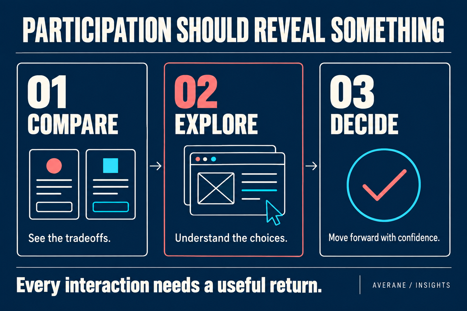
Interaction can require effort, but effort can create involvement. A person who manipulates a comparison, explores a project, configures a product, reveals layers of information, or makes meaningful choices is not simply receiving information. They are participating in the communication.
That participation can create stronger understanding because the user is actively constructing part of the experience.
The danger is obvious: interaction for its own sake quickly becomes irritating. Websites are full of unnecessary carousels, forced scroll effects, mystery navigation, hover-dependent content, elaborate loaders, and animations that exist primarily because someone knew how to build them.
That is not what we mean by good friction.
One established technique is progressive disclosure. Nielsen Norman Group recommends presenting the important options first and making secondary detail available when needed. That gives exploration a practical purpose while keeping frequently needed information easy to reach.
An interaction earns its place when participation improves the communication.
If clicking, dragging, scrolling, comparing, revealing, or choosing makes an idea easier to understand or an experience more meaningful, the interaction has a purpose. If the same information would be clearer and more enjoyable without it, the interaction is decoration masquerading as experience.
Friction Can Create Memory
One of the least discussed objectives in web design is memory.
Most companies do not merely need visitors to use their websites successfully. They need visitors to remember them after they leave.
That is especially difficult in markets where competitors use similar language, layouts, imagery, calls to action, and claims. A perfectly usable website can still disappear from memory five minutes after the tab closes.
Distinctive experiences create cognitive landmarks. A surprising interaction, unusual narrative structure, exceptionally clear explanation, meaningful transition, powerful piece of writing, or carefully paced reveal can create a moment the visitor remembers.
Not because it was difficult, but because it demanded enough attention to become distinct.
There is an uncomfortable truth here for optimization culture: sometimes the thing that slows the user down is the thing they remember.
There is a separate usability principle to protect here: recognition rather than recall. Making choices and relevant information visible reduces the need to remember details from another screen. A memorable brand experience should not depend on making people memorize how its interface works.
Again, this does not justify obstruction. Making a website confusing will certainly make it memorable, but for the wrong reason. The objective is not to manufacture difficulty. It is to recognize that attention has value and that design can earn attention rather than merely trying to minimize the amount required.
Friction Can Signal That a Decision Deserves Consideration
There are purchases where immediate action is desirable. There are others where immediate action can actually be inappropriate.
If someone is selecting a strategic partner, hiring a professional firm, choosing an enterprise platform, commissioning an architectural project, or making another high-consequence decision, a website that treats the choice like an impulse purchase can undermine the seriousness of the offer.
The experience should respect the weight of the decision.
That may mean providing deeper information before presenting a conversion opportunity. It may mean exposing methodology, tradeoffs, limitations, process, philosophy, or evidence. It may mean allowing the prospective client to determine that the company is not right for them.
That last point matters.
Not every conversion is good.
A strong website should sometimes disqualify as effectively as it persuades. If the experience helps the wrong client understand that the relationship is not appropriate before they submit a form, that is not necessarily lost conversion. It may be successful qualification.
The obsession with eliminating friction can obscure this because it assumes the objective is always to maximize the number of people reaching the next step.
For many sophisticated businesses, the objective should be to increase the quality of the people who reach it.
But There Is a Dangerous Line
The idea of good friction can be abused very easily.
Designers can use it to rationalize self-indulgent work. A confusing navigation system becomes “discovery.” An excessive animation becomes “storytelling.” Hidden information becomes “curiosity.” A ten-second loading sequence becomes “anticipation.” An inaccessible interface becomes “experiential.”
None of those things become good simply because someone gives them a more flattering name.
The burden of proof belongs to the friction.
A designer should be able to explain precisely what additional value the user receives because an experience requires more effort than the simplest alternative.
If that explanation centers primarily on how impressive the design looks, the friction probably serves the designer more than the user.
This is where discipline matters. Intentional friction is not permission to ignore usability. In fact, it requires greater understanding of usability because the designer must distinguish between effort that contributes to the experience and effort caused by poor design.
The more unconventional an interaction becomes, the more carefully accessibility, device behavior, performance, input methods, motion preferences, and user expectations need to be considered.
Good friction is intentional. It is also respectful.
Accessibility Is Not Negotiable
There is another boundary that should be explicit: accessibility should never be treated as friction that can be sacrificed for creativity.
A website may deliberately encourage exploration, but it should not require a particular physical ability to explore it. It may use motion, but users who reduce or disable motion should still receive a coherent experience. It may create unconventional interactions, but essential content and functionality should remain available through appropriate input methods and assistive technologies.
The distinction between intentional experience and unnecessary obstruction becomes especially important here.
A designer might decide that revealing information progressively creates useful anticipation. Fine. But if the mechanism makes that information inaccessible to someone using a keyboard or screen reader, the problem is not “creative friction.” It is exclusion.
W3C provides concrete boundaries for this work. Its keyboard accessibility guidance explains that functionality should be operable through a keyboard interface, with a limited exception for inherently path-dependent input. Its guidance on animation from interactions explains the Level AAA criterion allowing users to disable nonessential interaction-triggered motion. These are practical design constraints, not reasons to abandon expression.
The experience can ask for attention.
It should not ask for an ability the user may not have.
Mobile Changes the Equation
Friction is contextual.
An interaction that feels delightful with a mouse and large display can become tedious on a phone. A long narrative that works beautifully on desktop may require different pacing on a smaller screen. Hover behavior disappears. Precision decreases. Network conditions change. Attention may be more fragmented.
This does not mean mobile experiences must be stripped of personality. It means intentional friction has to be designed for the environment in which it occurs.
Responsive design should therefore consider more than whether elements fit on the screen. It should ask whether the cost of the interaction still makes sense.
If an interaction requires more effort on mobile, does it create enough additional value to justify that effort? If not, the experience should adapt.
That is a more sophisticated responsive-design question than simply stacking columns and shrinking typography.
The Right Amount of Friction Depends on Intent
Perhaps the biggest mistake is trying to establish one universal rule.
There isn't one.
A person resetting a password wants almost no friction. A person exploring an artist's work may welcome discovery. A person completing checkout wants clarity and speed. A person evaluating a complex consulting engagement may need depth. A person seeking emergency information should not be asked to participate in a cinematic experience. A person exploring a luxury product may value anticipation and immersion.
The correct experience depends on what the person is trying to accomplish and what they need to understand, feel, or decide before accomplishing it.
That means designers need to ask a better question than, “How can we reduce friction?”
They need to ask:
“Where should this experience be effortless, and where should it ask for attention?”
That is a fundamentally different design conversation.
It allows us to aggressively remove friction from the places where friction creates frustration while deliberately protecting the moments where attention creates value.
A Practical Framework for Intentional Friction
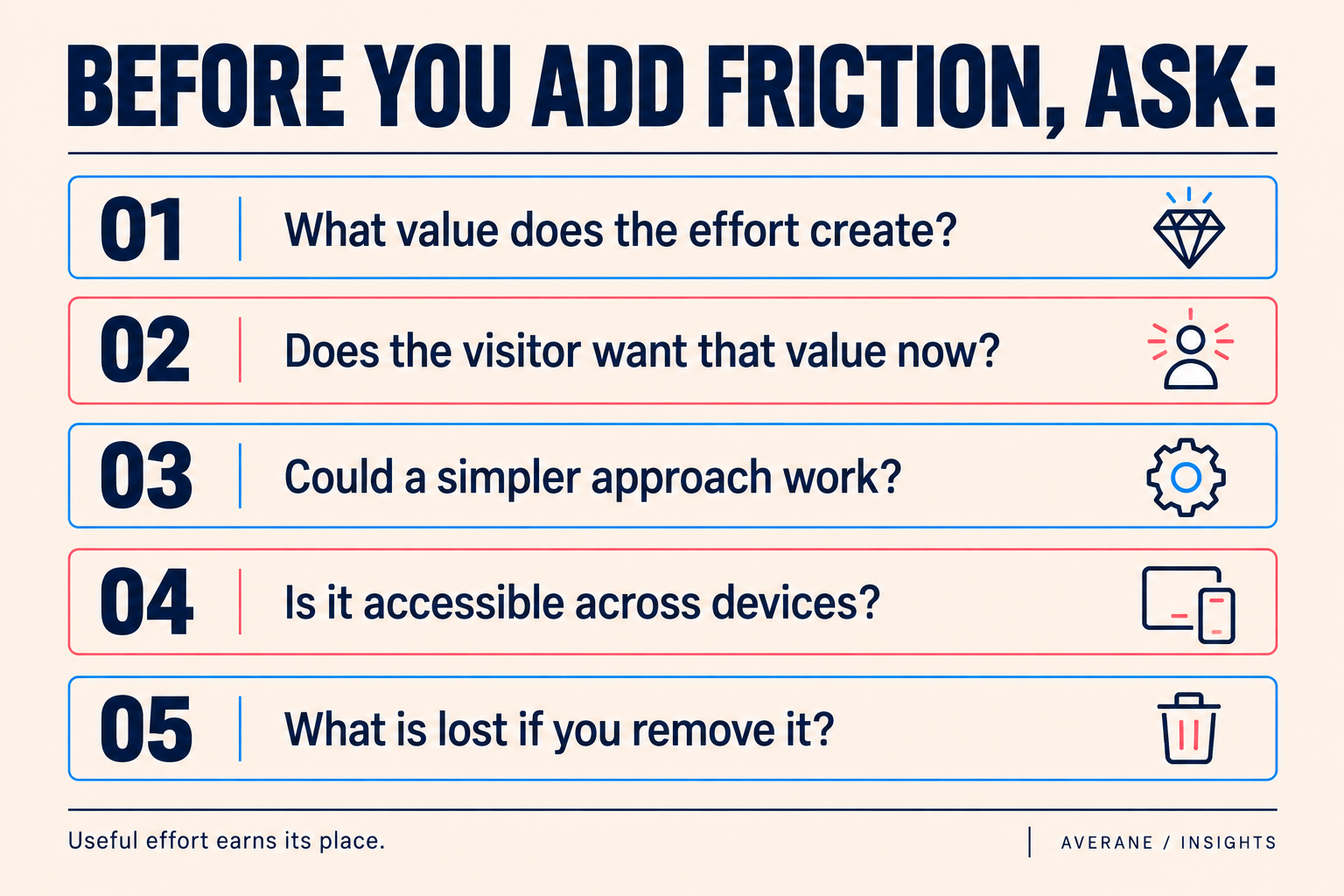
Before introducing any deliberate friction into a digital experience, we can test it against five questions.
First, what value does the additional effort create? If the answer is unclear, remove it.
Second, is the user likely to want that value at this point in their journey? A beautifully designed explanation can still be frustrating if someone is trying to accomplish an urgent task.
Third, is there a simpler way to create the same value? Complexity should not survive merely because it is interesting to build.
Fourth, does the experience remain accessible and functional across devices and input methods? Creative intent does not excuse exclusion.
Fifth, what happens if the friction is removed? This is perhaps the most revealing question. If nothing meaningful disappears, the friction probably was not meaningful either.
The objective is not to maximize friction or minimize it. The objective is to make every piece of effort earn its place.
The Conversion Funnel Is Not the Entire Experience
Traditional conversion thinking often imagines a funnel: awareness at the top, conversion at the bottom, and the job of design is to move people downward with as little resistance as possible.
That model is useful, but incomplete.
People do not always move neatly through websites. They compare tabs. Leave and return. Send links to colleagues. Search the company name. Read a case study days later. Discuss the decision internally. Look at competitors. Return directly.
A website can contribute to a decision long before that decision becomes visible in analytics. An explanation may help someone describe the problem to a colleague. A comparison may expose a tradeoff they had not considered. A project story may give them a reason to return. None of those moments guarantees a sale, but each can make the next conversation more informed.
That is why time on page, clicks, and form submissions need interpretation. A long visit might indicate interest, or it might indicate confusion. A shorter visit might mean someone found an answer quickly, or that they gave up. To understand the difference, combine the numbers with observed behavior, usability testing, and the questions people bring into actual conversations. Ask what visitors can explain after using the page, whether they can find the next step, and where they need help.
Design for the Decision, Not Just the Click
The title of this article is a challenge to a narrow definition of ease, not an argument for making websites difficult. Essential tasks should remain clear, dependable, and accessible. Someone who is ready to act should not have to earn the right to find a phone number, complete a form, or move past an animation. Depth should be available to the person who needs it, with a clear route forward for the person who does not.
The opportunity is to give attention a purpose. Let a comparison make the tradeoffs visible. Let a service page explain the thinking behind the work. Let a portfolio help someone recognize the decisions that made a project successful. Then test whether those choices help visitors understand, rather than assuming that a distinctive experience must be a valuable one.
This is also the connection to our first article on preparing a business website for AI agents. Clear information and reliable actions remain the foundation. The human experience can add depth, expression, and discovery around that foundation without compromising it.
At Averane, our website design and development approach brings those decisions together: what people feel, what they understand, and what they can do next. If your website makes essential tasks difficult, remove the obstacles. If it makes your business look interchangeable, examine what has been simplified away.
The goal is not to make visitors work harder. It is to make the attention they choose to give you worthwhile.